
The Strategic Foundation
Independent fast-food brands are on a middle ground where they aren't single-location burger boutiques, nor do they have the massive marketing budgets of global competitors. They need an identity that functions like a major chain, while keeping the approachable charm of a family-run business. The goal was to build a brand that captures the energetic and fun world of teens and families.
The name Moo&Chew established a rhythmic and unpretentious tone, which we anchored with the slogan: Best Moo’D Only. This copy acts as the strategic filter for the entire brand. It clearly associates with the brand name itself, but also evokes the playful energy we are trying to convey.
The Visual System
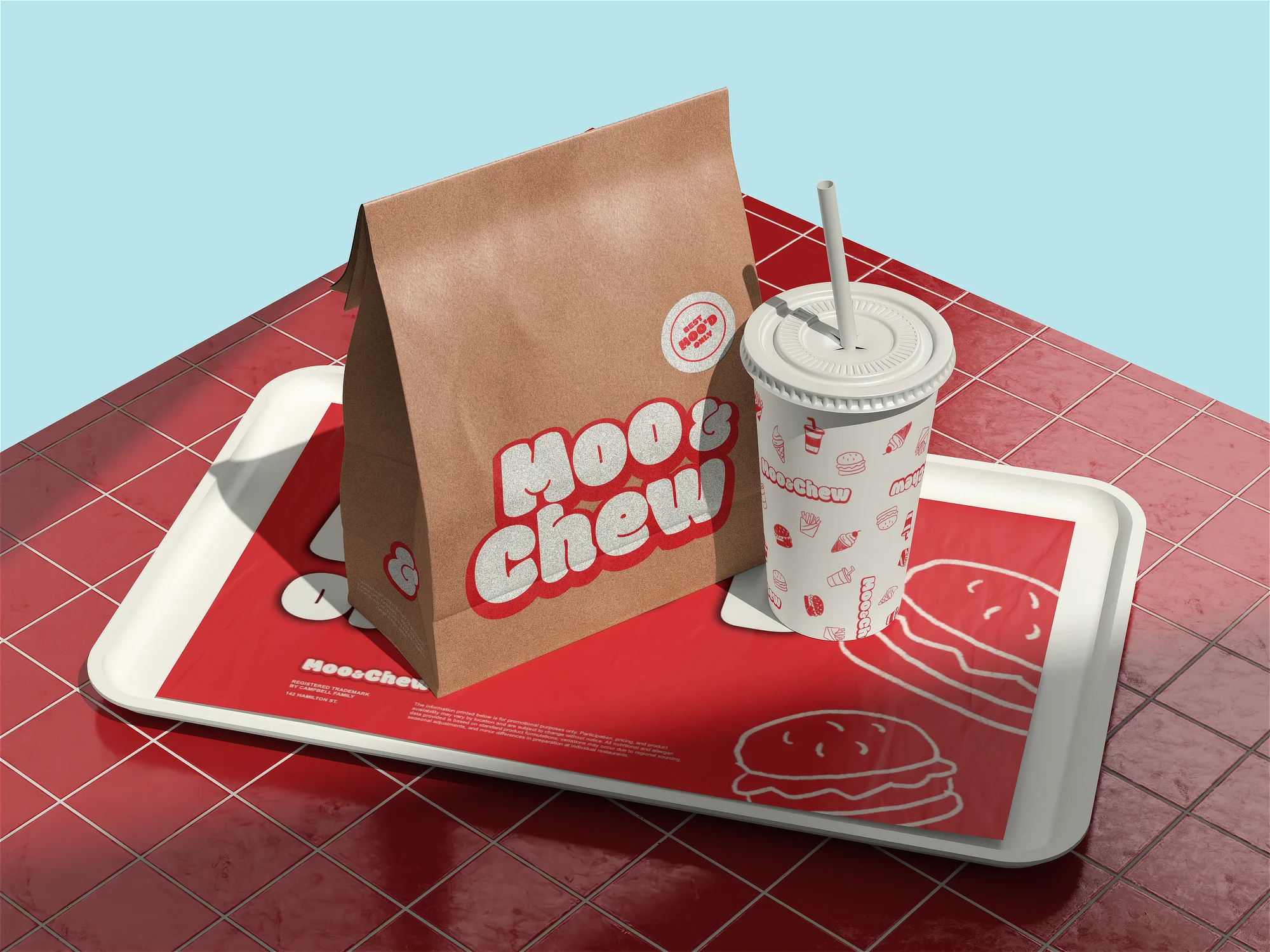
The design system combines classic Americana diner nostalgia with contemporary, almost cartoonish energy.
The typography was selected to completely match this energy, making sure the visual weight of the wordmark felt just as playful and as the name itself. We stayed rooted in traditional diner colors: red to trigger appetite and urgency, a comforting warm white, and a vibrant light blue as the primary accent color.
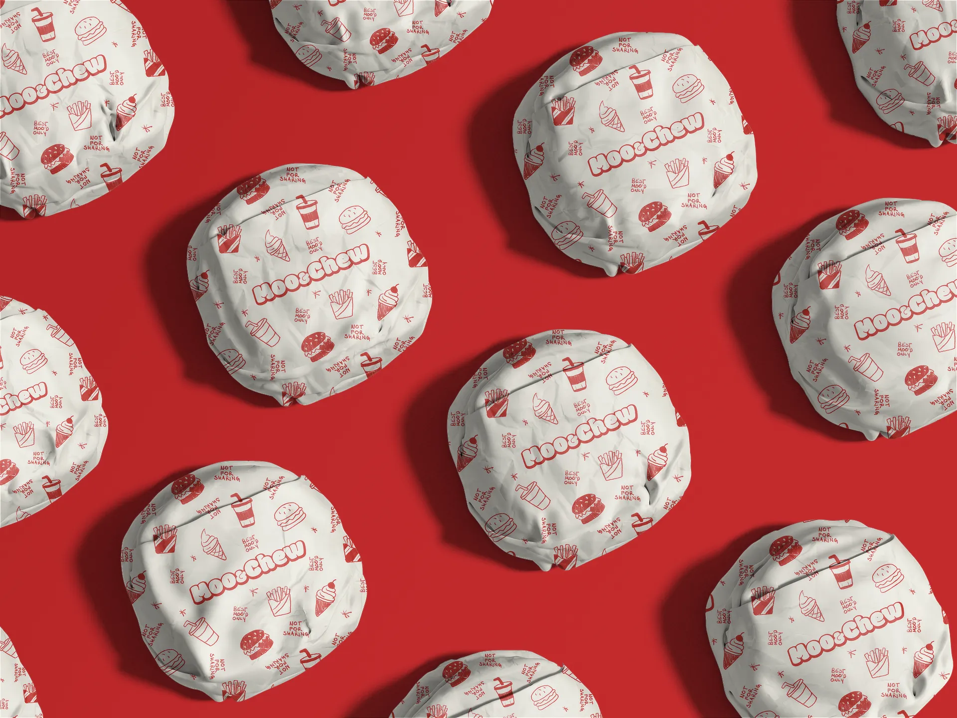
We hand-drew a custom set of brand assets (burgers, fries, soft-serve cones, and drinks) and made a brand pattern out of it, rather than using generic vector iconography. The hand-drawn elements act as the contrast to the usual mechanized personality commonly found in the industry.
Copywriting and Social Media
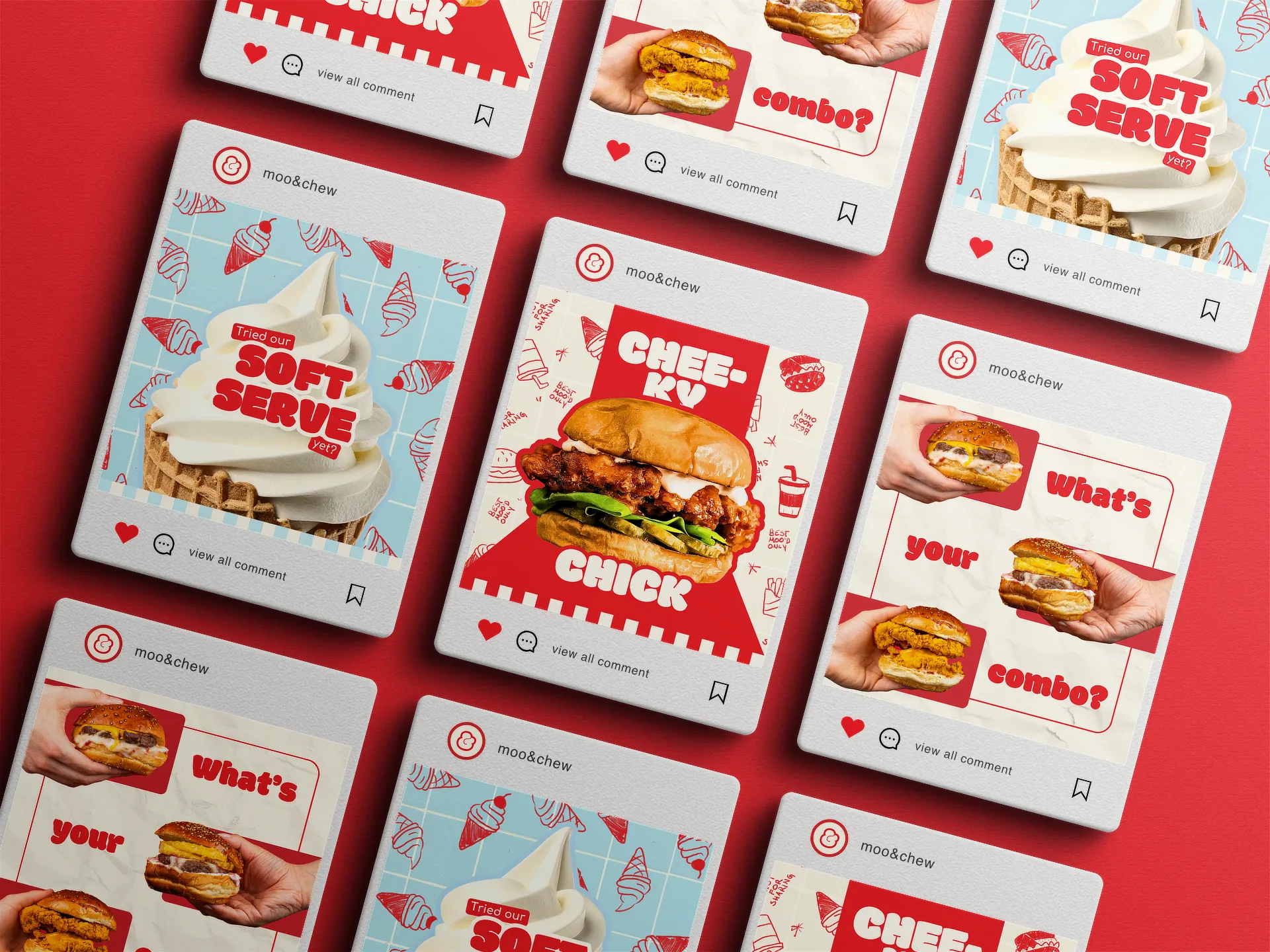
The digital strategy was designed to embrace the loud, fast-paced nature of fast-food marketing, without losing the brand's independent spirit. The system relies on a mix of clean product promotion, engagement posts, and occasional jabs at the competition.
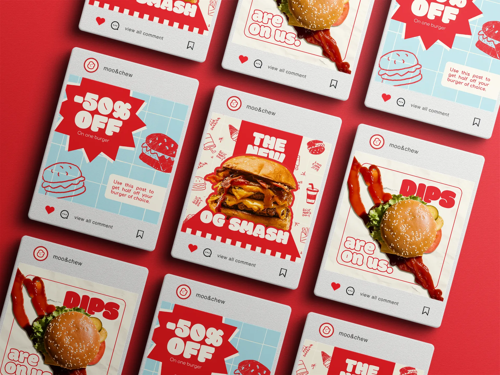
We designed punchy, statement-driven graphics like "Dips are on us" to highlight the generous nature of a family business, contrasting it with global chains that famously charge extra for every minor addition. Furthermore, neighborhood spots like this thrive entirely on local traffic, so building a true community following makes actual sense. Instead of shoving complicated corporate loyalty apps down the locals' throats, we designed social media coupons to give regular customers a genuine, friction-free reason to follow and support the brand. Visuals like "Show this post for 50% off your burger" were designed to be instantly readable while scrolling, turning digital engagement into immediate counter sales.
Additionally, the whole social media asset pool was built for long-term operational independence. A major part of the promotional material was designed to allow easy modification of assets, ensuring the owners don’t have to rely on an external help for day-to-day operations.

Packaging Design
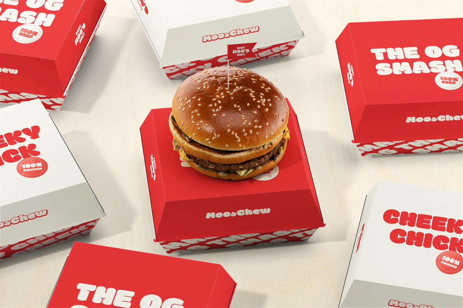
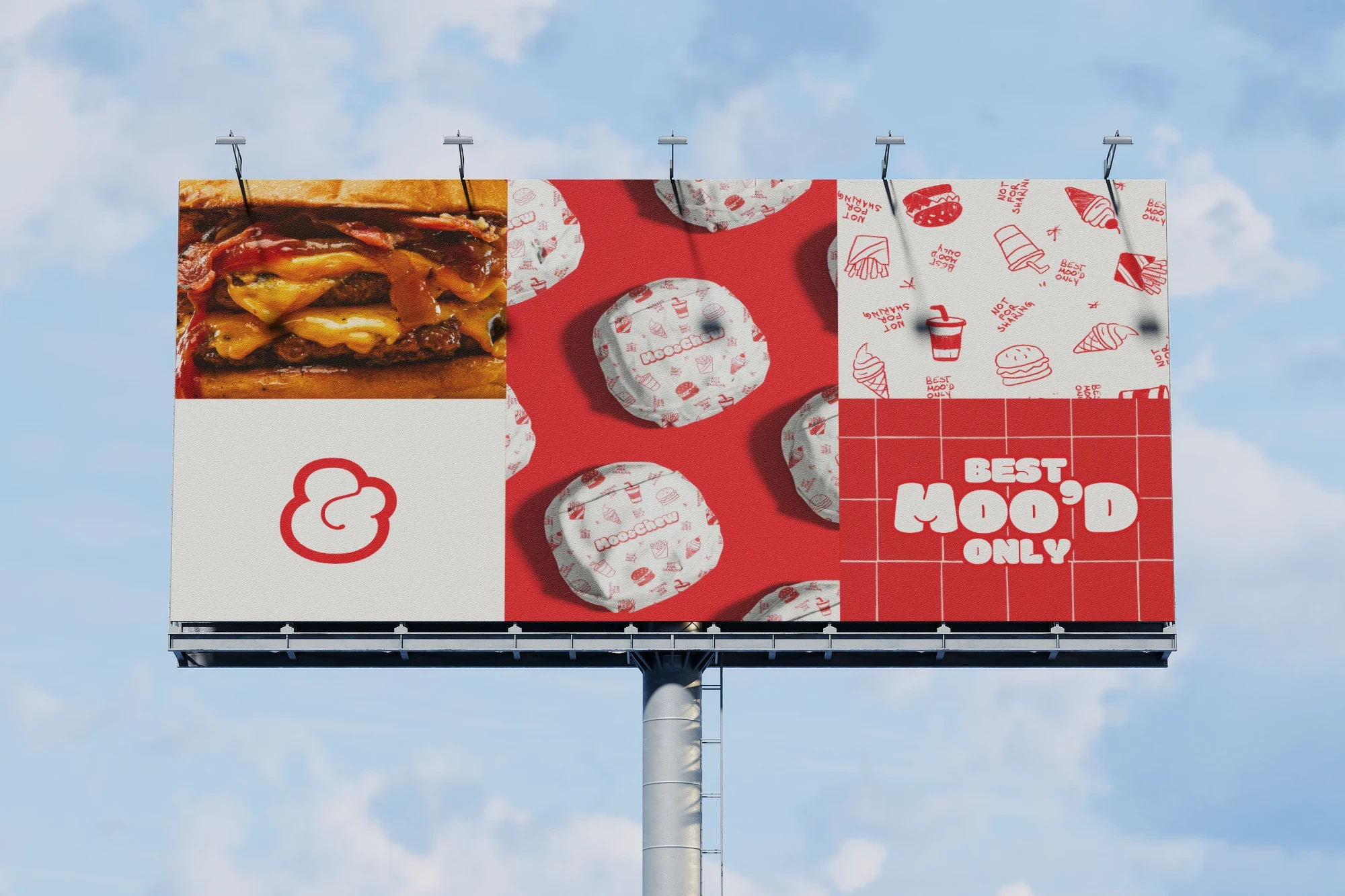
The packaging system splits the visual assets intentionally to avoid overwhelming the consumer. The core burger boxes lean into a cleaner, more structured application of the brand. They rely heavily on the primary color blocking and prominent name placement to make the product feel more organanized and premium.
The custom hand-drawn iconography came together as a repeating pattern on the burger wrappers. This creates a high-energy contrast when the customer opens the box, which gives seamless visual interest.
Moo&Chew shows that local fast food doesn't have to try copying bigger chains or look cheap to feel approachable. By pairing a playful aesthetic with sharp copywriting, we gave a family-run business the credibility of a major chain without stripping away its independent soul.
Disclaimer: Concept project developed for portfolio presentation.