
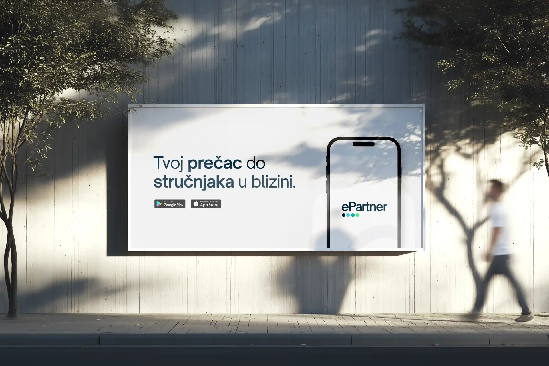
The Strategic Foundation
At first glance, ePartner could have been just another booking app. The core of its business is connecting everyday users with professional service providers. So, the brand needed to resonate with B2C users and B2B providers, especially in a market flooded with similar services.
We divided the audience into two layers: End-users and Service providers. The End-users are people seeking convenience without sacrificing quality. They value efficiency and intuitive interactions, but also enjoy a friendly experience. The service providers are largely small business owners and professionals who need a platform that is easy to use and reliable, while reflecting their own quality.
The mission was to make ePartner feel approachable and simple, yet convey reliability and professionalism. Balancing these POVs was our primary focus.
The Visual Identity
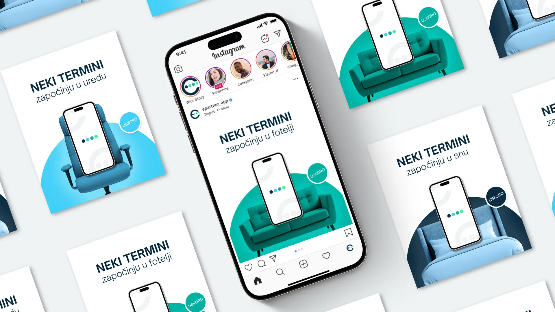
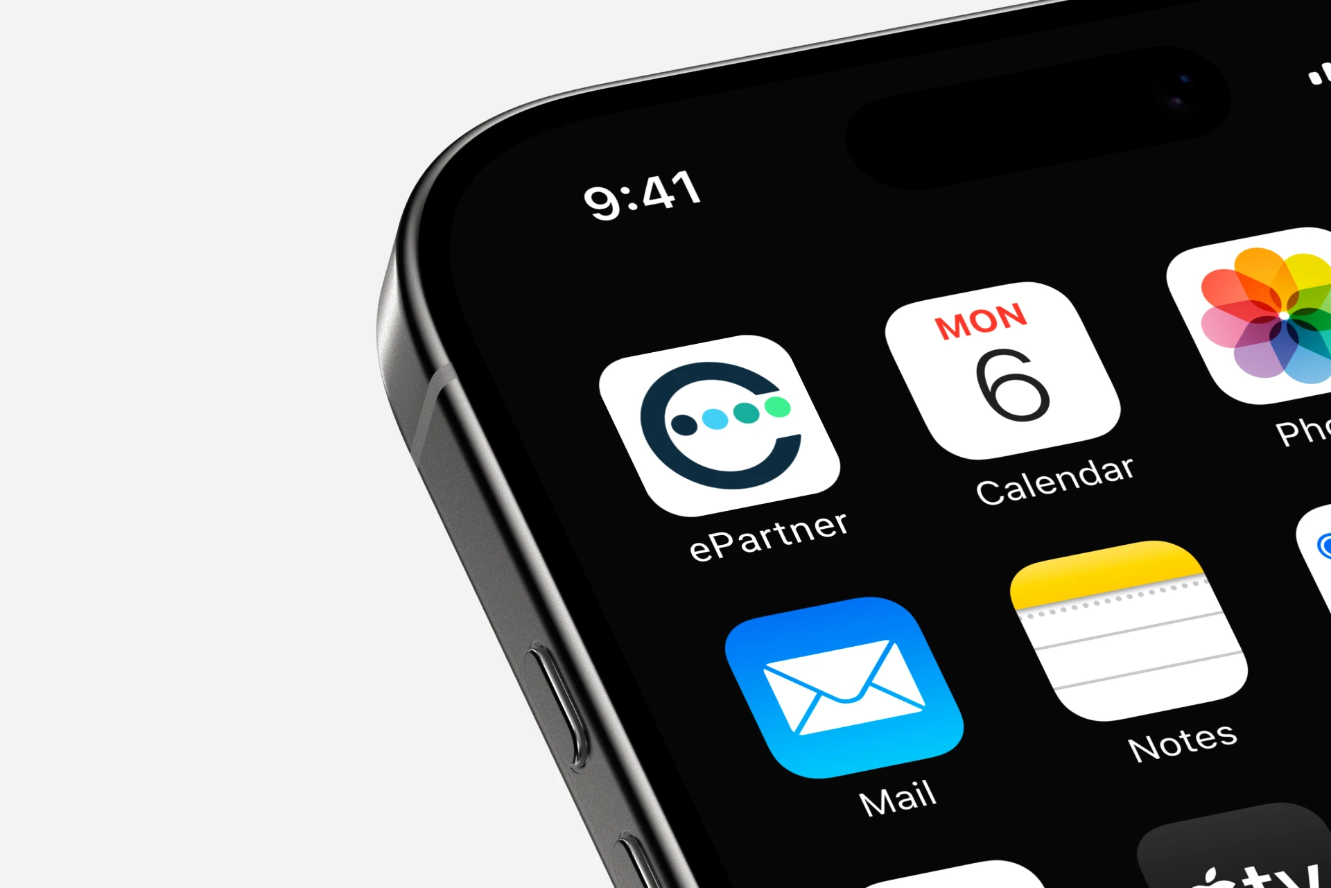
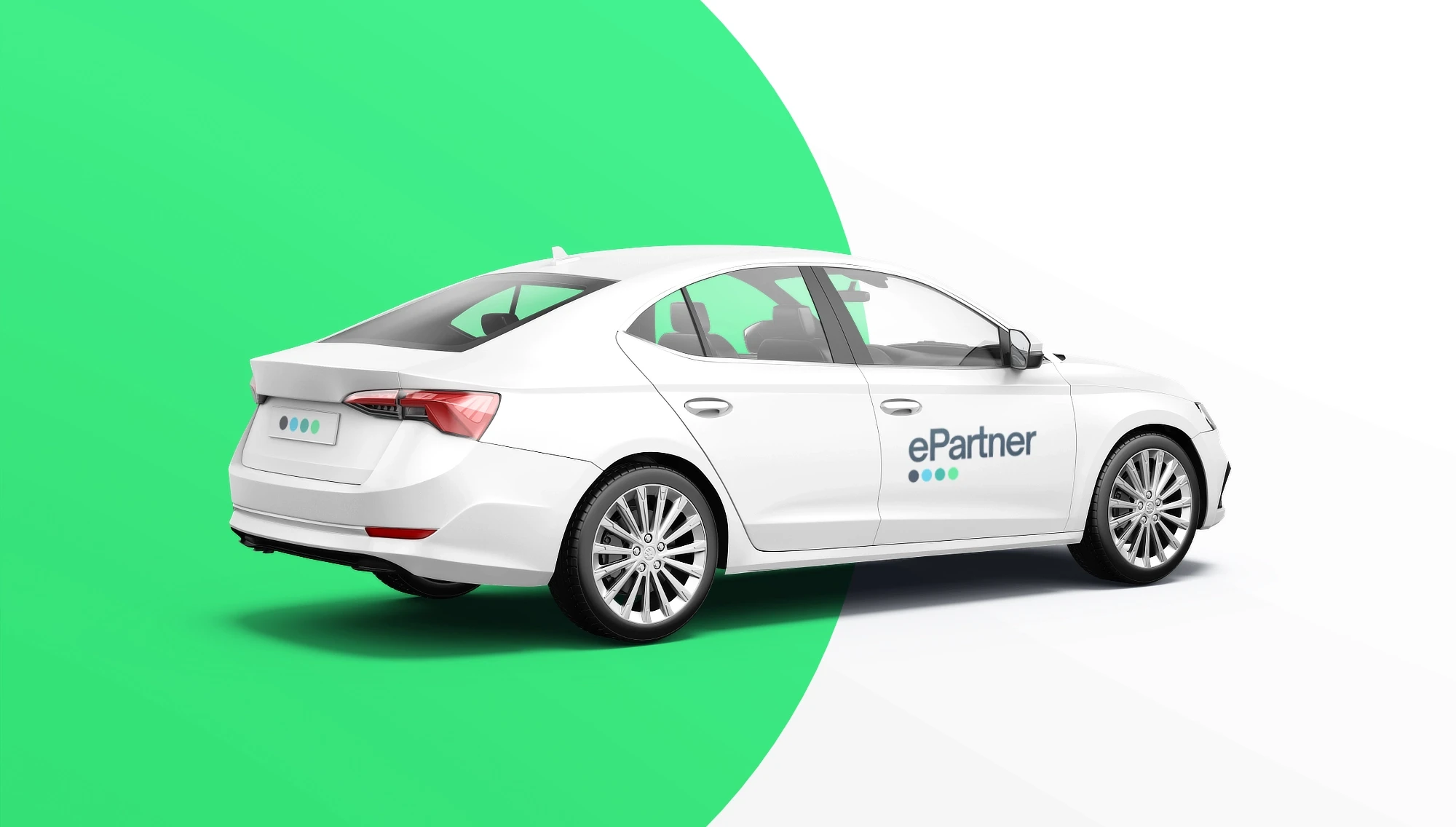
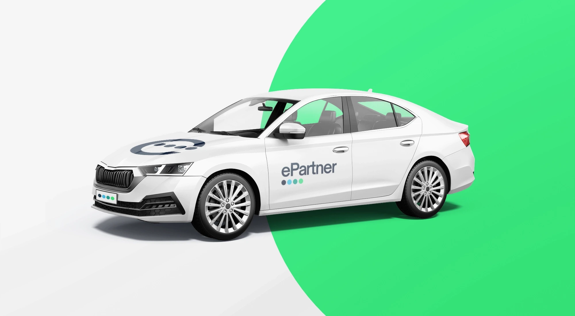
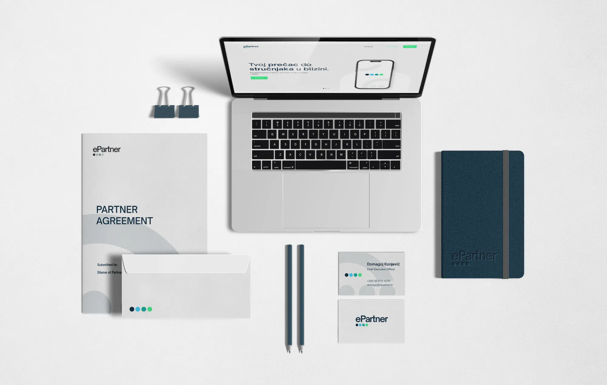
We developed the visual identity through collaboration with the clients to make sure the design captures the brand’s personality in every detail. The logotype is clean and modern, featuring four colored circles below the text that create a small, dynamic visual moment. The circles signal the four main service categories the app offers: car, wellness, home improvement and professional services.
These categories are represented using a palette of dark blue, light blue, dark green, and light green. The colors are inspired by natural gradients, which gives the brand a lively yet grounded visual presence. Nothing about the identity should feel forced, but still reflect the brand's approachable professionalism.
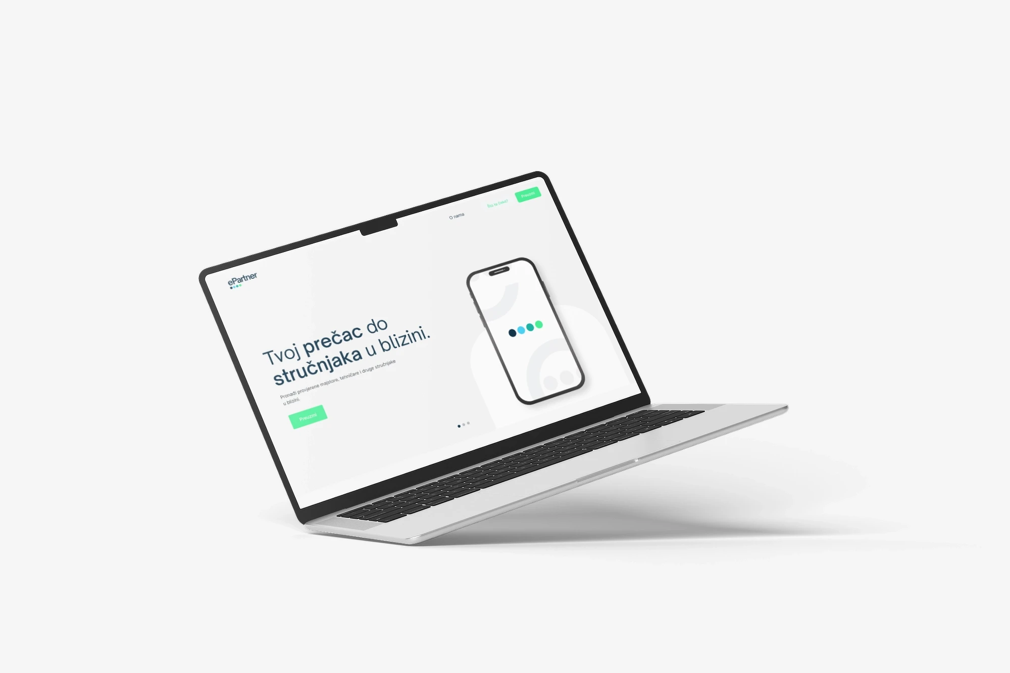
For typography, we selected a highly legible, geometric typeface that remains instantly recognizable across all digital formats. Th UI layouts were kept airy, using generous whitespace to reduce cognitive load, make navigation effortless.
The Copywriting
The voice mirrors the team behind the product: relaxed, approachable, friendly, but still trustworthy and reliable. The goal was never to sound corporate, yet never to feel careless.
Messages are clear and warm, which makes users feel guided rather than sold to. Every line reinforces the brand’s dual promise: effortless usability and dependable service. The result is a voice that feels human and confident, one that supports both sides of the platform equally.
The most effective brands are those who find their own lane. ePartner is not positioned as a disruptive tech giant or a loud marketplace. It is designed to feel balanced and dependable from the very first interaction. By aligning strategy, visual identity, and tone of voice, we created a brand that works comfortably in both B2C and B2B contexts. The system is simple but distinctive, flexible yet consistent. And in a market full of similar solutions, that personality becomes its strongest differentiator.