
The Strategic Foundation
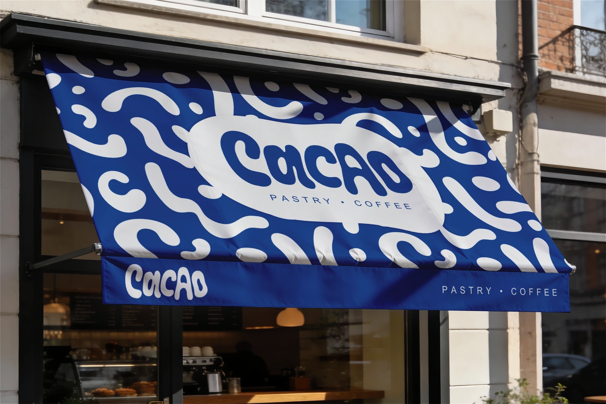
Most pastry shops go for the same old rustic, minimal look or basic pastels. For Cacao, we wanted something completely different. We needed an identity that is bold and full of character, but still feels super friendly.
We anchored the brand with the tagline "Freshly Hand-Made." It acts as the main filter for everything we designed, reminding people of the artisanal quality behind the pastries while keeping the vibe warm and approachable.

Visual Identity
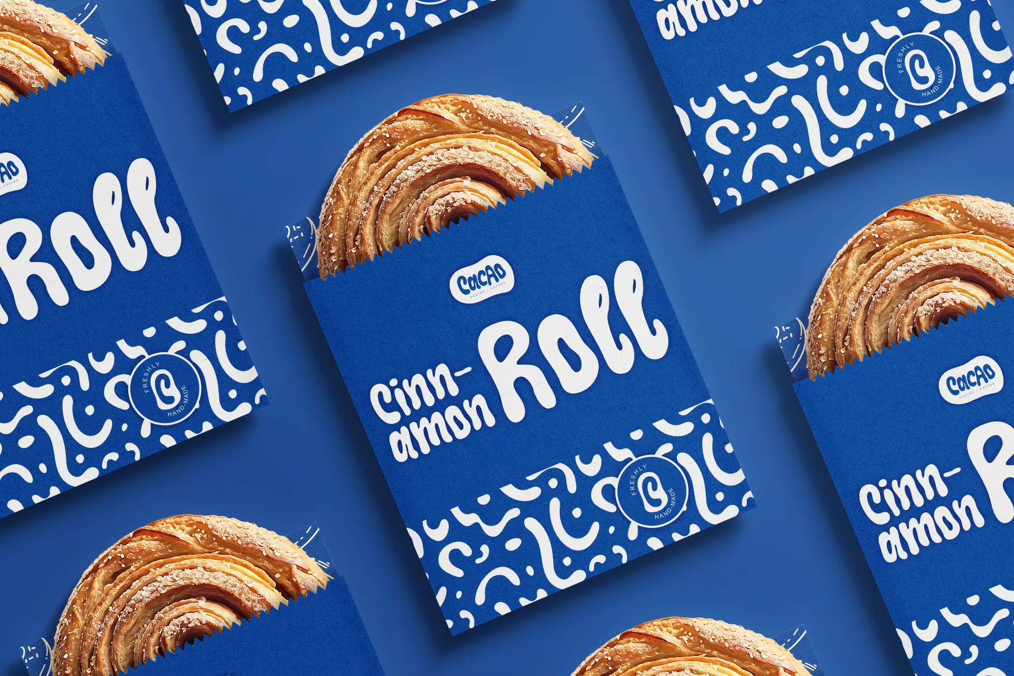
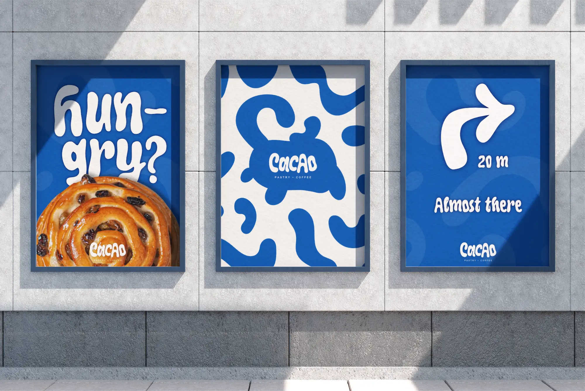
The whole identity is built around a unique, organic logotype with fluid letterforms to give it a hand-crafted feel. To make the system work across different applications, we created a palette with a bold combination of rich blue and clean white. It’s high-contrast, modern, and steers clear of predictable bakery colors. The logomark that embeds the organic 'C' inside a filled-in shape is taken directly from the 'O' in Cacao. We tied the whole brand together with a fluid, abstract pattern that mimics the curves of the typography.

Packaging Design
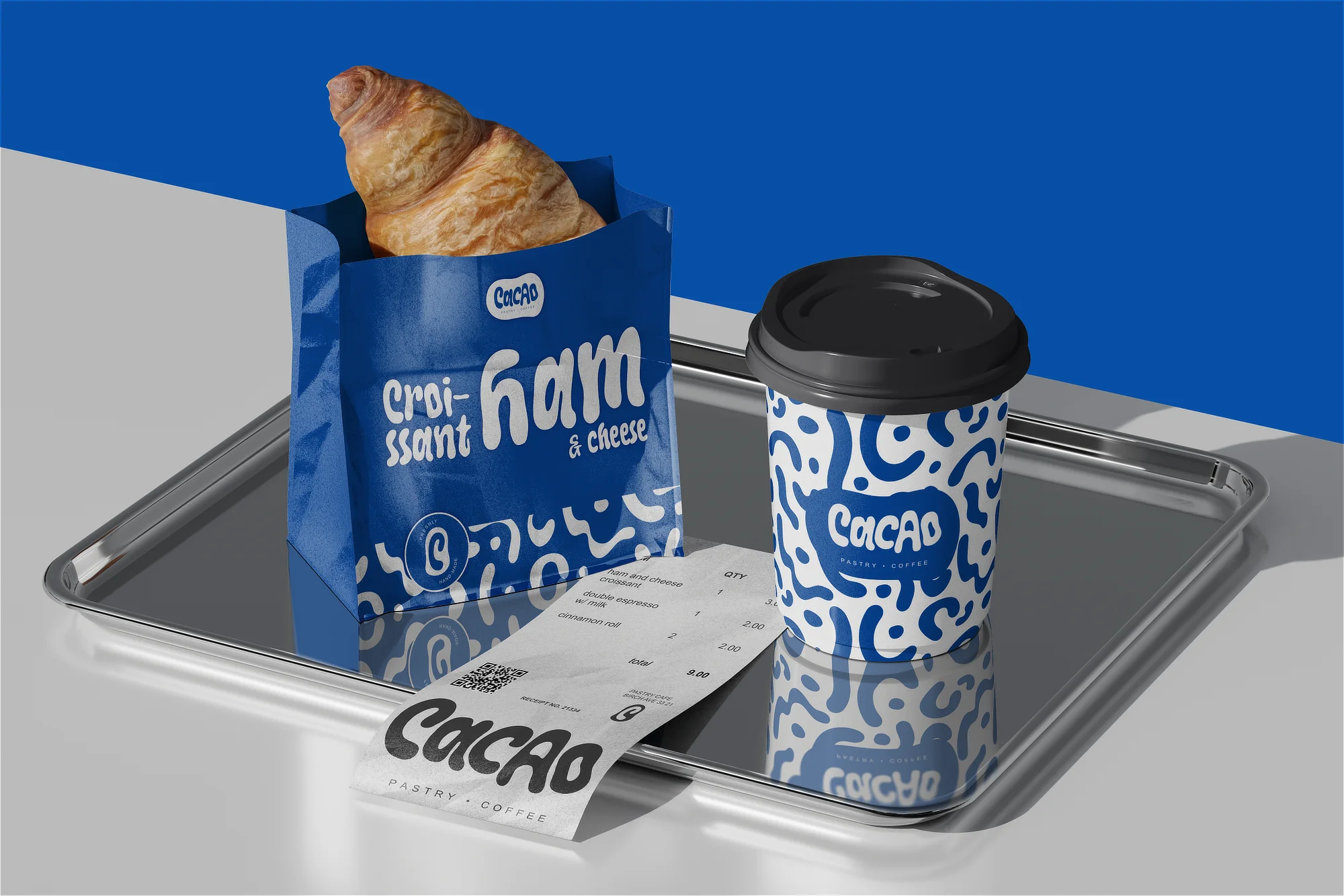
Instead of a generic, one-size-fits-all look, the packaging system uses three distinct variations mixing the logo, the logomark, and the pattern. For the pastry packaging (like the boxes and wrappers for croissants and cinnamon rolls), we went with a loud, premium look: a solid blue background covered in the pattern, with the name of the specific baked good written in large, expressive type. On the coffee cups, the "Freshly Hand-Made" tagline curves perfectly around the circular logomark.
We also designed two different takeout bags to give the shop options. The blue bag is clean and minimal on the front, with the logo in the bottom and the pattern hidden only on the sides for a nice pop of detail. The kraft paper bag gives a more grounded look using brown paper with a sharp blue print and pattern at the top.

The Outcome
Cacao shows that a brand can be fun and high-end at the same time. Usually, pastry shops are either super minimal and cold, or they look cheap. By mixing the squiggly, blobby typography with a clean blue and white palette, we made something that has a ton of personality but still looks professional. The whole system is also flexible enough to look great on everything from a coffee cup to the takeout bags to interior walls.
Disclaimer: Concept project developed for portfolio presentation.